
When constructing a simple contact form for use on smaller screens why not try using display:none; to reference the <td class“top” etc. >, as an alternative to having the label above the input field.
CSS
@media screen and (max-width: 450px) {
  .top {
    display: none;
  }
}
HTML
<tr>
    <td>
        <label for="Full_Name" class="required"></label>
    </td>
    <td valign="top">
        <input type="text" name="Full_Name" id="Full_Name" placeholder="Full Name" maxlength="80" style="width:230px">
    </td>
</tr>
In the browser...
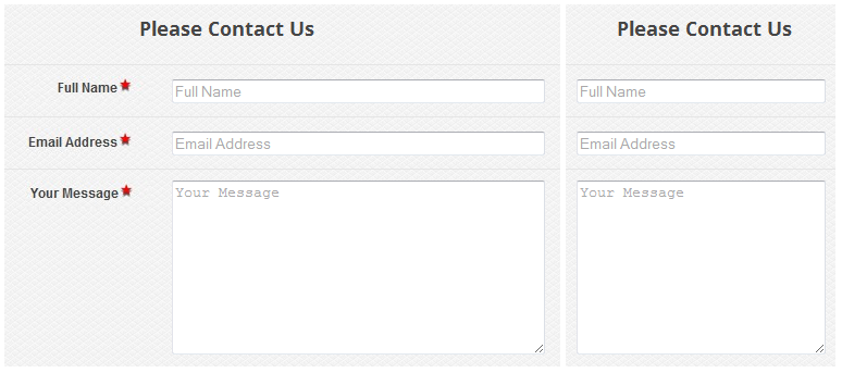
Illustration of the rendering in a wide and narrow screen
NOTE: Be sure to use placeholder text if employing this technique.